YouTube has announced changes to the design of creators’ channels on its TV app. The updates include more accessible action buttons, such as the “Subscribe” button, a modern design, and other tweaks. In addition, the company first introduced artists’ pages last fall.
These changes are part of a larger YouTube makeover. Additionally, it includes integrated voice search in the search bar and a menu redesign to make navigation easier. Further, it has a new vertical video info menu and larger thumbnails, among other things.
Focus on Immersive Layout Design and Subscriber Engagement on YouTube
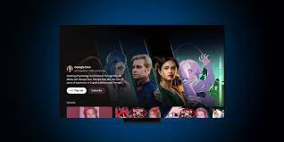
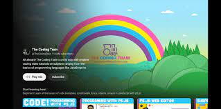
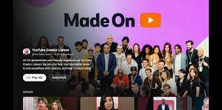
The update offers a more immersive layout design that “surfaces the most relevant content.” In addition, it makes the Subscribe button easier to access. The updated page offers an option for users to play a mix of video content from the channel. The company advises the new Subscribe button Creators to prepare 16×9 full art for their channel banner uploaded to the platform. This is because the app will now display new art edge-to-edge.
Impact on Creators and Viewers
The changes are rolling out to all creators today. However, it may take a few weeks to appear to all viewers. It’s important to note that the changes impact the channel pages on TV only. The redesign comes shortly after YouTube’s reveal of new data. Thus, it indicates that top creators who spend the majority of their watch time on TV have grown more than 400% in the past three years, according to a recent post by YouTube CEO Neal Mohan.
Competition and Strategic Positioning of YouTube
YouTube is in competition with traditional TV and streamers like Netflix on TVs. In addition, with newcomers like TikTok, which launched its own TV app in late 2021. The company’s focus is on enhancing the viewing experience on TV screens. As a result, it reflects its strategic positioning in the evolving landscape of digital content consumption.
Creators are likely to take the changes positively as they aim to boost subscriber numbers. In addition, it will better showcase their content on the big screen.
Also Read: https://thecitizenscoop.com/apple-ios-17-4-to-unveil-new-cartoonish-flair-to-emojis/
Conclusion
The redesign of creators’ channel pages on YouTube’s TV app represents a strategic move to enhance the viewing experience and engagement for both creators and viewers. As YouTube continues to evolve and compete in the digital content space, these updates demonstrate the platform’s commitment to providing an immersive and accessible environment for content consumption.
