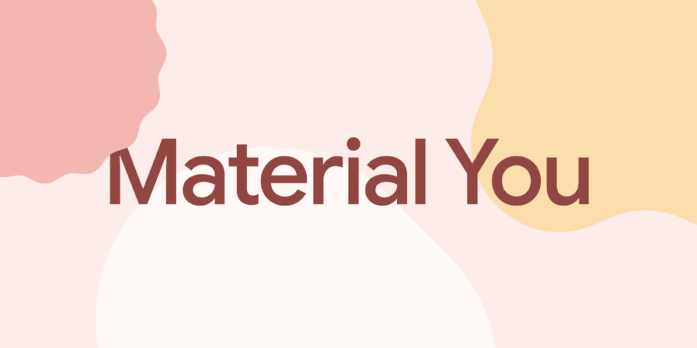
Google continues to evolve its Material You design language with updates to progress bars and sliders. These small but meaningful tweaks, including rounded corners, new motion behaviors, heightened color contrast, and improved indicators, aim to enhance accessibility, clarity, and usability.
Updated Progress Bars by Google
The updated progress bars in Material You feature a sleeker rounded look, departing from the previous boxy aesthetic. Google has also introduced a gap between the “track” and the active indicator to better highlight progress. This design change aims to improve accessibility and clarity. Additionally, Google has added end-stop indicators to the progress bars.
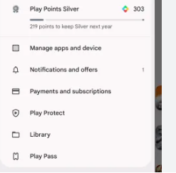
Some Google apps, such as the Play Store and Google Photos, have already implemented these refreshed progress bars. For instance, in the Play Store, tapping on the profile icon reveals the new-look Play Points indicator. Google Assistant’s download progress bars also incorporate the updated Material You aesthetic.
Redesigned Material You Sliders by Google
In addition to progress bars, Google has made tweaks to the design of Material You sliders. Sliders allow users to adjust settings like volume and brightness. The company has replaced the previous thin slider with a pill-shaped thick track. The slider handle is now a simple vertical line instead of a circle.
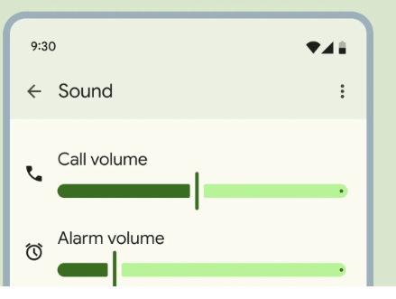
Similar to the progress bars, Google has introduced a gap between the slider handle and the track. When selected, the handle adjusts in width, becoming very thin temporarily. Slider tracks also adapt their shape when sliding to the edge.
Google has already launched the new progress bars in some apps. However, the redesigned Material You sliders have yet to be rolled out. However, these changes demonstrate Google’s commitment to continuously refining and improving its cross-platform design language.
Compatibility and Availability
It’s important to note that not all Android skins will see these design changes. Devices running stock Android, such as Motorola, Nothing, and Google Pixels, will see these tweaks across the board once they are available. Other devices will only experience the changes in apps that comply with Material You, such as Google’s suite of apps.
Also Read: https://thecitizenscoop.com/apple-unveils-a-new-ios-17-3-update/
Conclusion
Google’s Material You design language is evolving with updates to progress bars and sliders. The changes, including rounded corners, increased color contrast, and intuitive motions, aim to enhance usability and accessibility. The company has updated the progress bars in some Google apps. However, the company has yet to roll out the redesigned sliders. These design updates reflect Google’s ongoing efforts to refine and improve its cross-platform design language.